Azzuro
Restaurant
Timeline:
12 weeks Duration
Role:
Product Designer Front-End Developer
Tools:
Photoshop Figma Next.js TypeScript Tailwind
Overview:
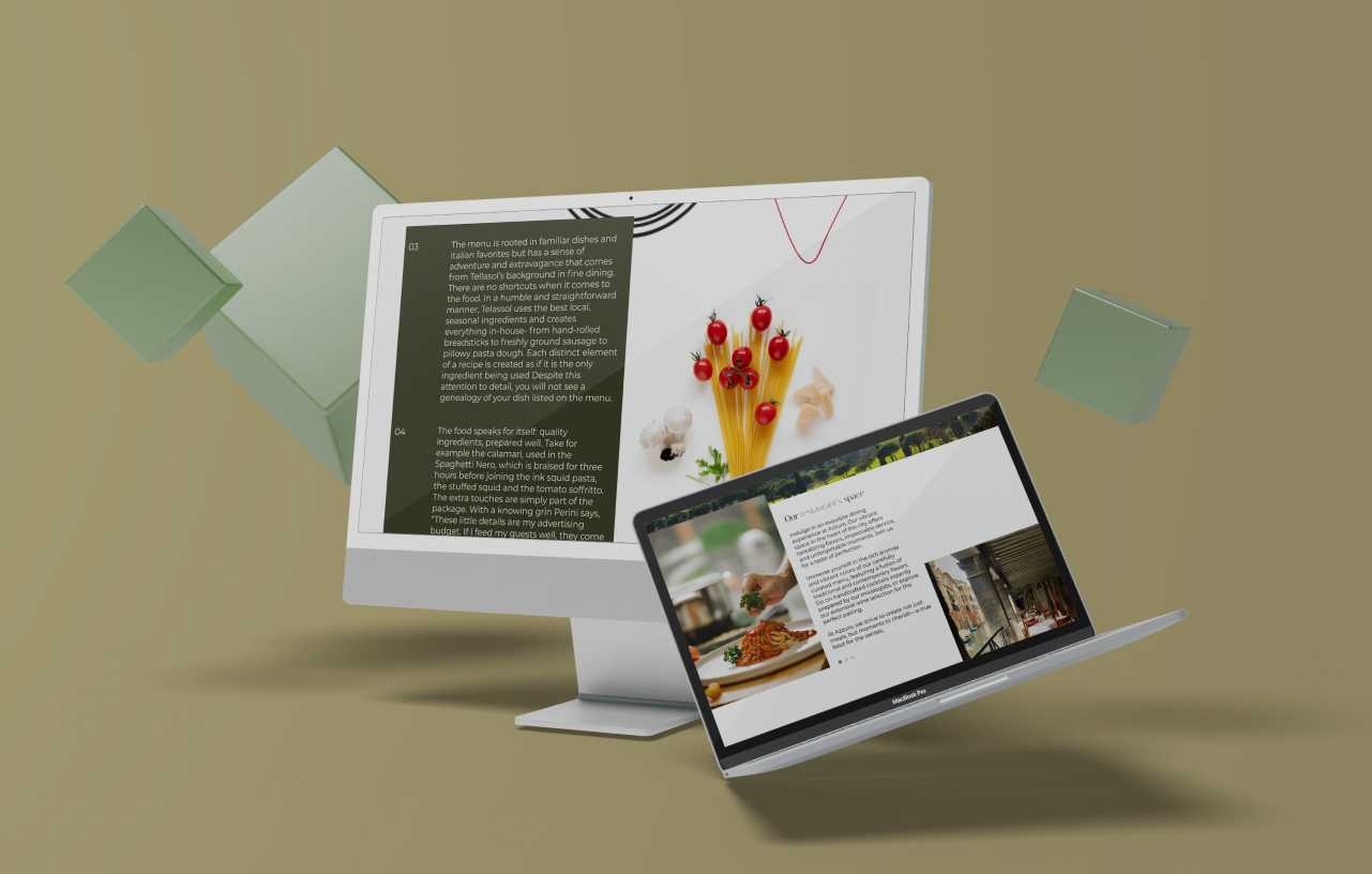
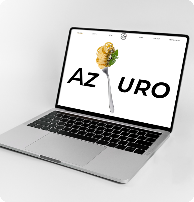
This project is an updated website for Italian restaurant.
The design of the existing side looks outdated, is not very user-friendly, has poor quality photos and lacks information important to customers (menu and site information and etc.). Therefore, the goal of the project was to create a modern and convenient design that could potentially attract customers.
The target audience is people of any age who want to eat deliciously. Before starting the redesign, research and analysis of competitors was carried out. This helped me out to understand which successful solution can be used for this project.
I used a 5-stage Design Thinking model proposed by the Hasso Plattner Institute of Design at Standford (the “d. school”). The stages of the Design Thinking process are as follows:
Empathize:
01/03
The Problem:
Azzuro Italian Restaurant's website was outdated and needed an upgrade. It was not user-friendly, lacked engaging photos, and had a poor navigation system, making it difficult for visitors to use and enjoy.
02/03
The Solution:
To fix these issues, I aimed to create a modern and attractive website by:
0.1
Enhancing Visual Appeal: Adding high-quality photos of the restaurant, its dishes, and ambiance to make the site more inviting.
0.2
Improving Navigation: Implementing a simple navigation bar and clear structure to help users find information easily.
0.3
Modern Design: Updating the design to be more tech-savvy and aligned with current web trends.
03/03
Define Goals:
My next step was to define user goals and business goals:
User Goals:
0.1
Easily find menu information and special offers.
0.2
Efficiently book a table with minimal time and effort.
Business Goals:
0.3
Enhance Brand Visibility & Engagement.
0.4
Boost online reservations and improve client conversion ratio through the website.
04/03
Ideate:
0.1
Analysis:
As part of my competitive analysis for Azzuro Restaurant, I conducted a detailed comparison of three popular pizzerias in Vancouver: Lupi, Nook, and Via Tevere. I analyzed their presence on the Apple App Store, assessed their strengths and weaknesses, and reviewed their market strategies. This analysis provided key insights that have helped shape my approach for Azzuro, highlighting areas where we can improve based on what the competition is doing well.
0.2
Interview Guide:
Following the initial competitive analysis, I moved to create an interview guide, which I used to conduct interviews with five people who matched my target demographics. These conversations were instrumental in developing User Personas, helping me understand potential customers on a deeper level.
The target audience for Azzuro is quite diverse, including food lovers, weekend diners, couples looking for a cozy meal, families, and anyone with a love for authentic Italian cuisine. By diving into their feedback and observing their dining habits, I have been able to fine-tune strategies and offerings to better align with what our varied and vibrant audience is looking for.
0.3
Site Map:
Next, I created the site map, which clearly outlined the site's structure and how users would navigate through it.
0.4
Design System:
Then, I worked on the design system, focusing on choosing the right colors and typography. I chose olive green and khaki colors, because they evoke a warm, earthy feel that complements the brand’s identity. I also created a mood board to capture the essence and feel of an authentic Italian pizzeria.
Empathy Map:
The empathy map for Azzuro Italian Restaurant helped me to gain a deeper understanding of the restaurant's customers by visually organizing and analyzing their experiences, thoughts, and feelings.
I gained a clearer understanding of how to identify pain points and which parts of the website need improvement to better meet customer needs.
05/03
Prototypes:
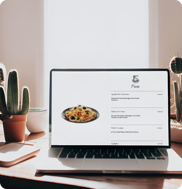
Afterwards, I created a low-fidelity wireframes to outline the basic layout and content placement on the website. In the final phase, I developed high-fidelity wireframes and prototypes for Azzuro restaurant. My main focus was on creating a smooth, user-friendly navigation experience, making it easy for visitors to explore the menu by highlighting specific options.
06/03
Validate:
The final step involved thorough testing of both the Figma prototypes and the website. I tested the Figma prototypes using Maze, and for the website itself, I conducted tests with the original five interviewees plus five additional users. Based on this feedback, I made refinements, including simplifying scroll animations to avoid overwhelming users.
For quality assurance, I used BrowserStack to test the website's performance on both desktop and mobile versions, ensuring a seamless experience across all devices.
07/03
Final Takeaways:
I'm a fan of minimalist design and aimed to create a beautiful, easy-to-navigate website. I'm proud to say that this goal was accomplished. I believe that typography and color also play a crucial role in the website's success.
The feedback from users has been positive, and I believe this website has great potential if it moves forward.
07/01
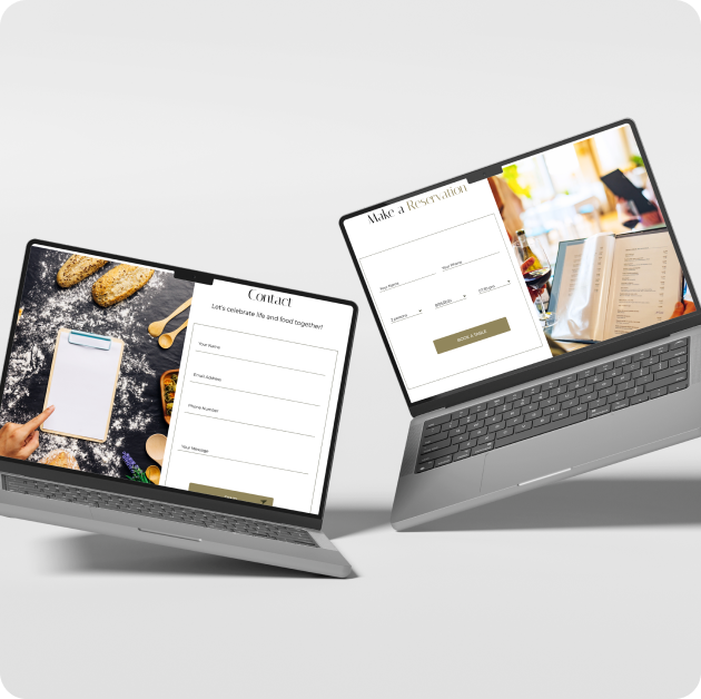
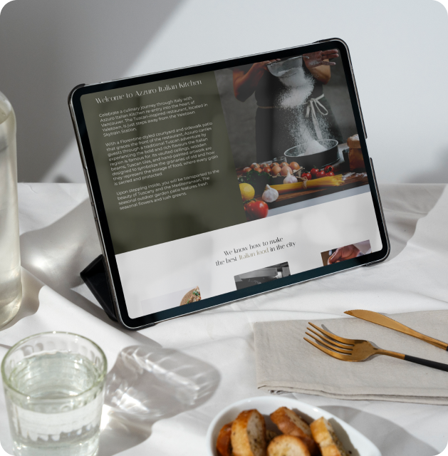
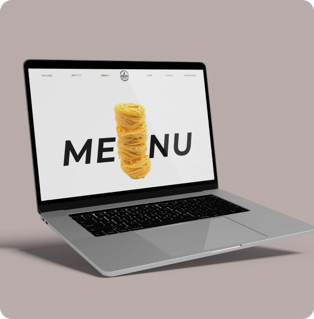
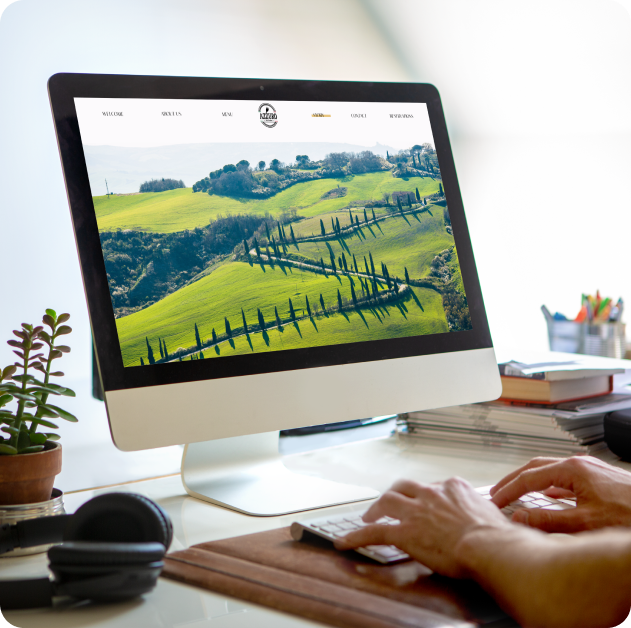
Final Design: