Up-Immigration
Website
Timeline:
16 weeks Duration
Role:
Product Designer
Tools:
Photoshop Figma
Overview:
Embarking on the journey of immigrating to a new country is a significant life decision. Having adequate support and assistance in your chosen destination is crucial for a smoother and more efficient adaptation process.
I had the privilege of playing a key role in redesigning of “Up Immigration” website , working collaboratively with a team of three talented designers, guided by our mentor, Caio Castelluber.
I used a 5-stage Design Thinking model proposed by the Hasso Plattner Institute of Design at Standford (the “d. school”). The stages of the Design Thinking process are as follows:
Empathize:
01/03
The Problem:
Moving to a new country can be overwhelming, and support is essential. The 'Up Immigration' website, however, feels cluttered and hard to navigate due to too much text and few visuals. It lacks engaging images and a clear navigation system, making it difficult for users to find information. A simpler layout, improved visuals, and better navigation would significantly enhance the user experience.
02/03
The Solution:
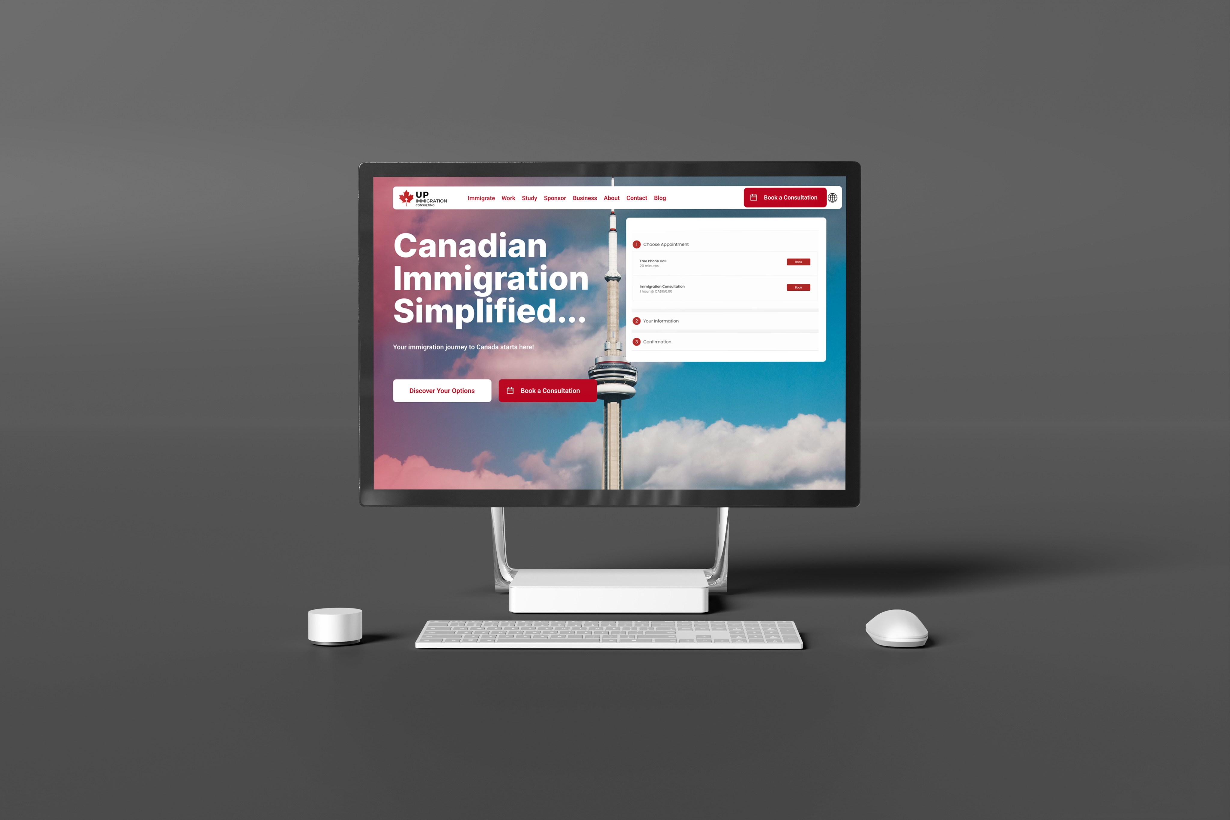
The solution involves creating easy-to-navigate buttons and prominently highlighting the 'Book a Consultation' button on each page. This approach aims to make it easier for users to find and use this feature. The main goal is to attract more users to the website and encourage them to book a 20-minute free consultation.
03/03
Define Goals:
My next step was to define user goals and business goals:
User Goals:
0.1
Quickly finding essential information about immigration services, fees and requirements.
0.2
Efficient application process, to save time and reduce the complexity.
Business Goals:
0.3
Increase conversion rate by refining the user journey and making it easier for visitors to become clients.
0.4
Improve the overall design of the website to reflect professionalism, trustworthiness and credibility.
Discovery Stage:
I then created a research plan and questions to guide the design process and better understand the Customer Mental Model for the Immigration Website.
Interview Guide:
The interview guide focused on identifying the target audience and creating personas. The target audience included newcomers or aspiring immigrants to Canada, specifically students or professionals who are in the “serious” research stage.
Firstly, I sent screener questions to over 20 individuals and interviewed 5 of them.
04/03
Ideate:
0.1
Empathy Map:
Next, I created an empathy map, to clearly define how the typical user of the Up Immigration website thinks, feels, says, and needs, focusing on both their pains and gains. This exercise provided valuable insights into our customers' experiences, helping to better understand their journey and expectations.
0.2
Site Map:
Next, I created the site map, which clearly outlined the site's structure and how users would navigate through it.
0.3
Design System:
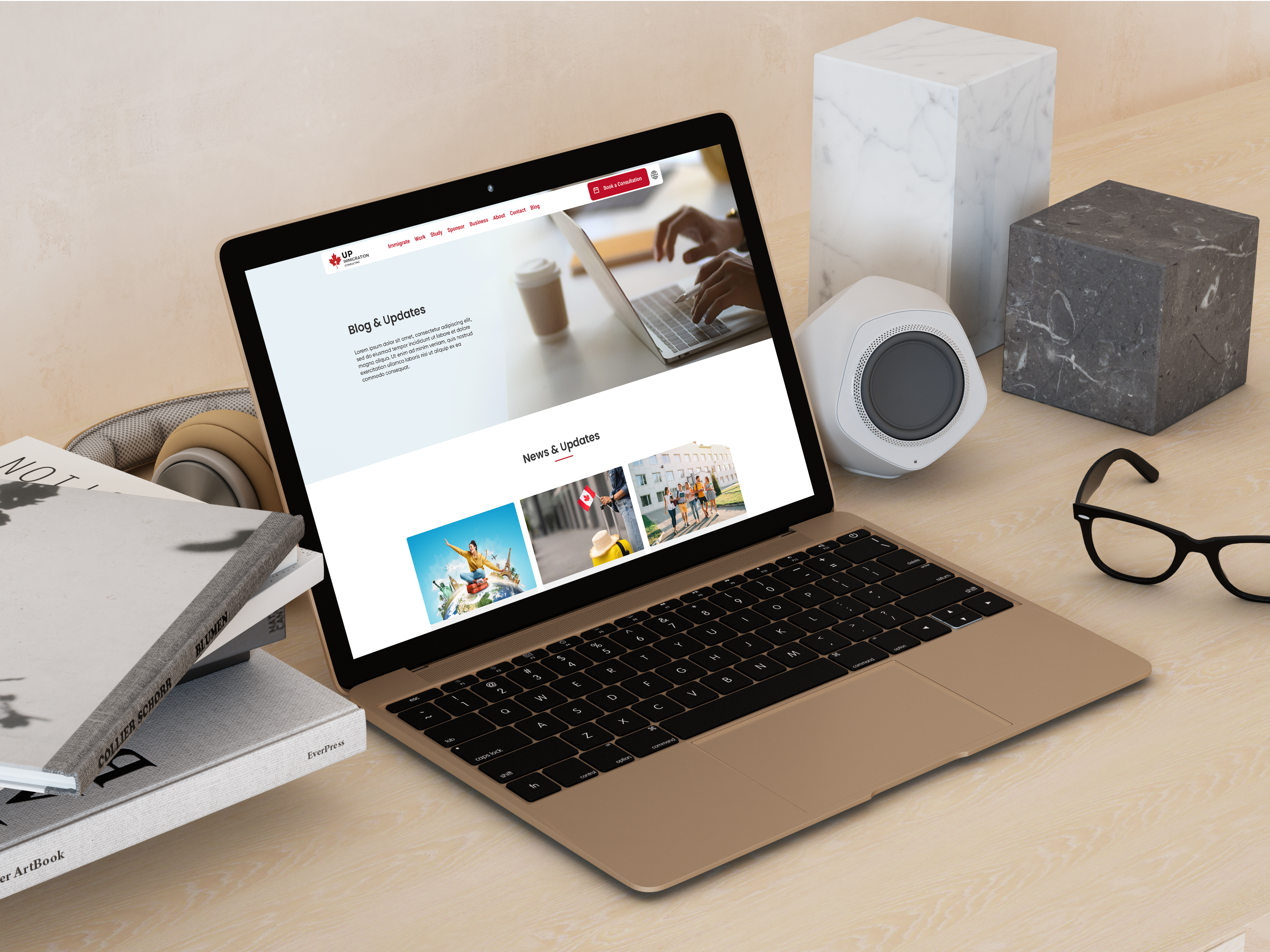
I developed the design system using red, black, and white to reflect the Canadian flag and evoke warmth, fitting the brand identity. For typography, I chose Poppins for its modern, clean feel, enhancing trust and professionalism while maintaining a clear visual hierarchy.
04/03
Competitive Analysis:
As part of the Define phase, I conducted a competitive analysis of six immigration websites to identify gaps in our current site. I compared their layouts, assessed which information was highlighted, and noted what was missing. Using these insights, I brainstormed and developed solutions to address the identified problems and enhance our website’s user experience.
05/03
Prototypes:
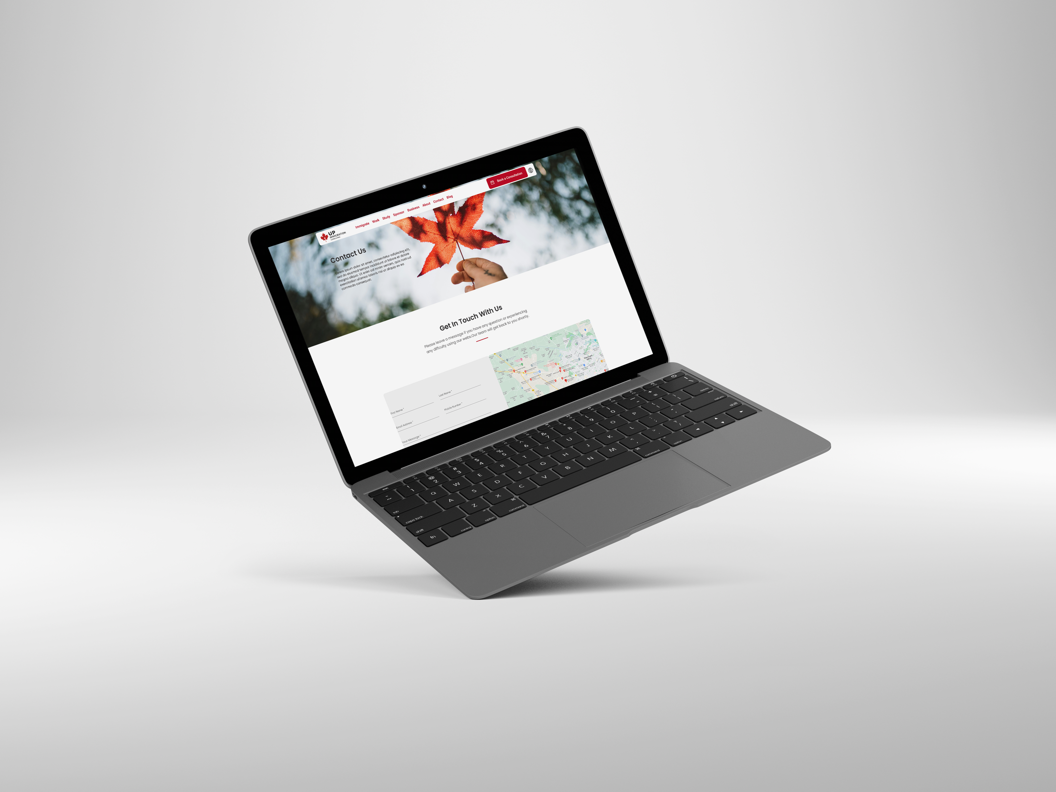
After the initial stage, I designed low-fidelity wireframes to map out the core structure and content layout for the Up Immigration website. In the final phase, I moved on to developing high-fidelity wireframes and prototypes. My main objective was to craft an intuitive and user-friendly navigation experience, making it easy for users to explore the site and access key services efficiently.
06/03
Validate:
In the final stage, I tested the website with the original five interviewees to see how easily they could navigate. This was an important step before launching. Based on their feedback, I made further adjustments to the 'Discover Your Options' and 'Book a Consultation' buttons for better usability.
07/03
Final Takeaways:
Redesigning the Up Immigration website was a rewarding collaboration between three designers, where I gained valuable experience working alongside others. The biggest takeaway for me was learning how to effectively collaborate and communicate, especially when explaining and justifying design decisions based on user needs. I had the pleasure of working with Caio Castelluber and Samea Oliveira on this project.
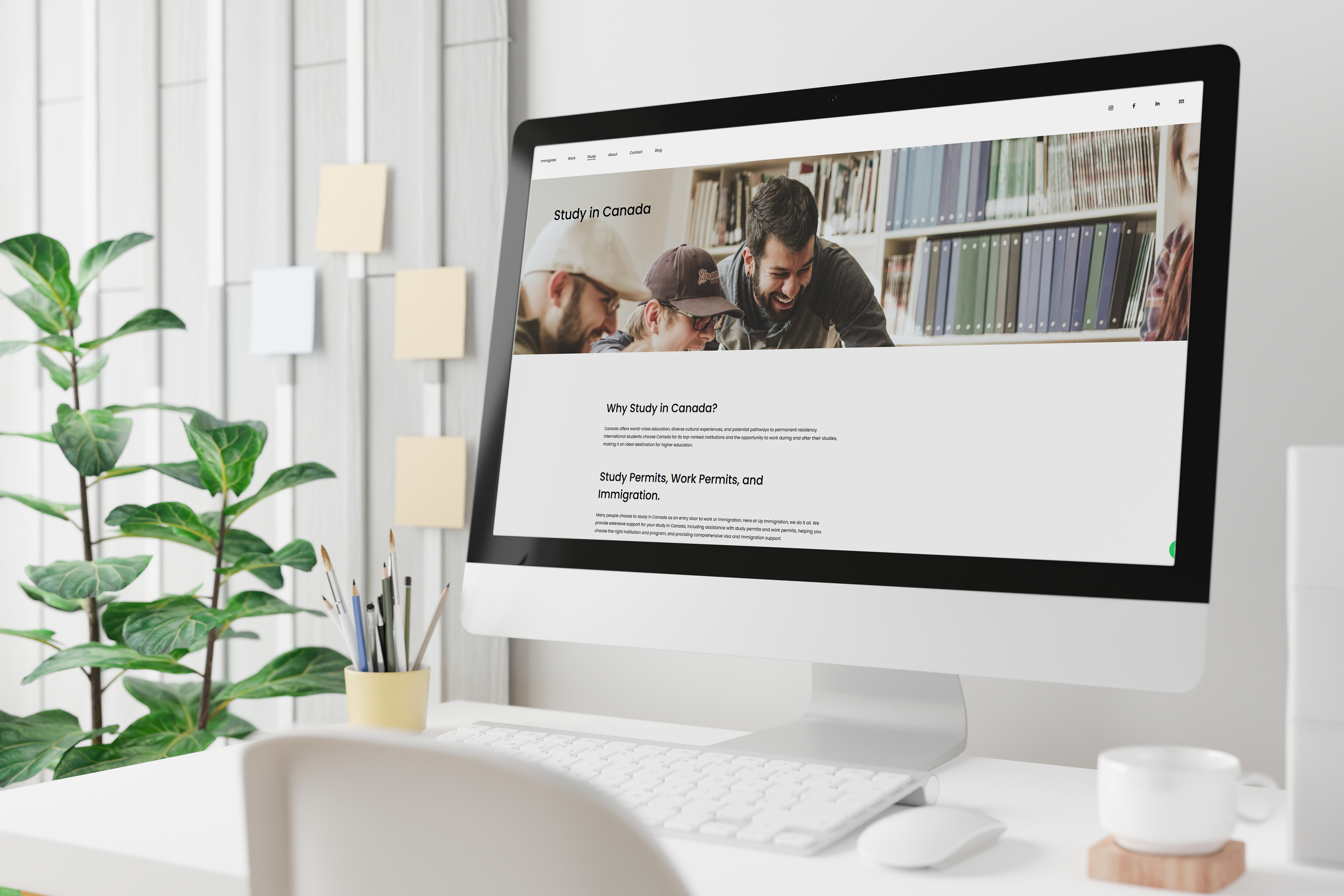
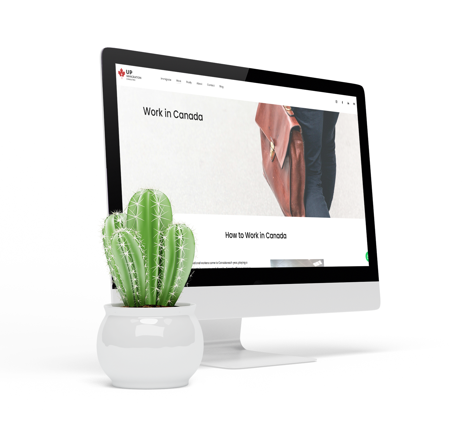
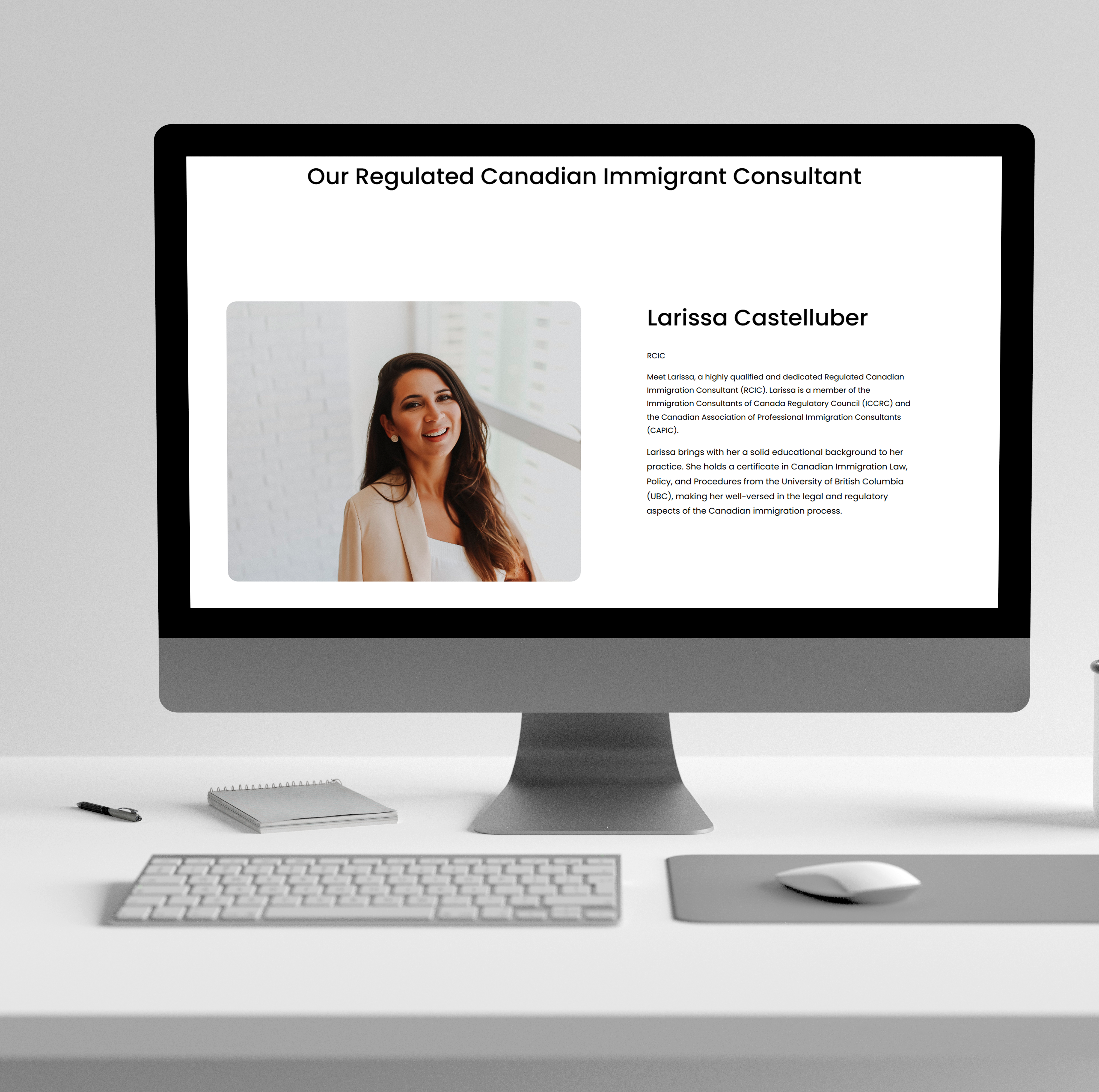
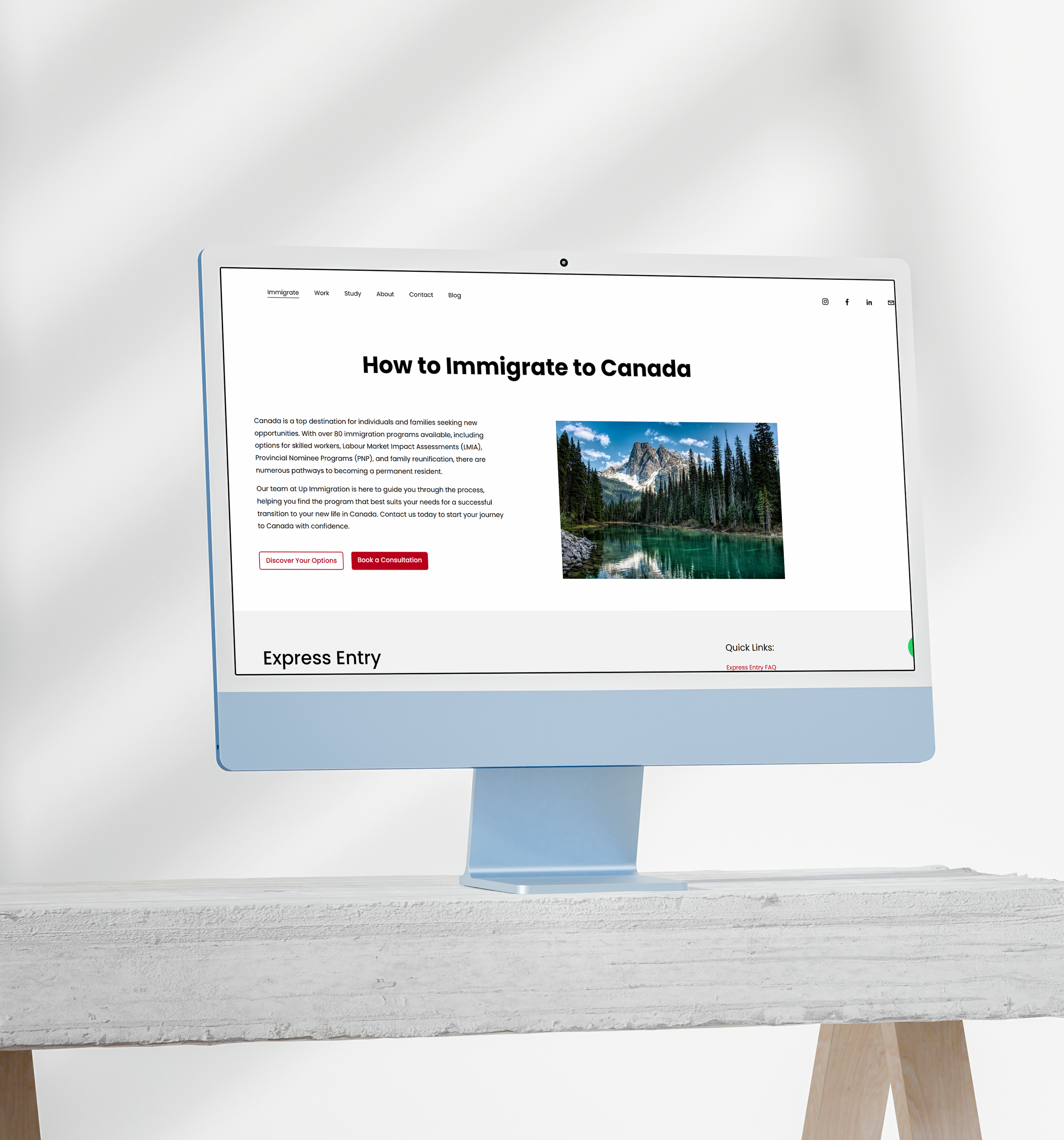
Final Design: